From Pantone www.pantone.com
What is going to be important in the interiors market for SS13? Read on to find what our friends at Pantone have to say: "To create the 'magic' that ultimately leads to sales in the marketplace, colors for 2013 will need to coax and cajole, soothe or astonish, renew and replenish," said Leatrice Eiseman, executive director of the Pantone Color Institute. "At the same time, there will be the consumer's expectation of practicality - what colors will have staying power and can be relied upon as a steadying influence in unsteady times. Skillfully balanced color palettes that play to their practical side, while satisfying their aspirations, hopes and needs for something novel will remain key to enticing the would-be consumer or client."
Pantone View Home + Interiors 2013 is a forecasting book that provides color and trend direction, enabling designers to select the right shades and combinations for home furnishings or interior spaces. The book contains visual inspiration, suggested color harmonies, individual tear-out palette cards for each of the nine forecasted palettes, swatches of the 75 forecasted colors, and images from the forecast for use in presentations and storyboards. Highlighting additional insight and directions, a summary page concludes the forecast with a comprehensive color overview and a look at other factors influencing the world of home furnishings and interior environments.
To enable digital design, Pantone View Home + Interiors 2013 also includes Pantone Color Manager for direct download of all Pantone Color Libraries into design software.
The nine palettes for 2013 are: Connoisseur, Glamour, New Old School, Rugged Individuals, Extracts, Footprints, Sojourn, Surface Treatments and Out of the Ordinary.
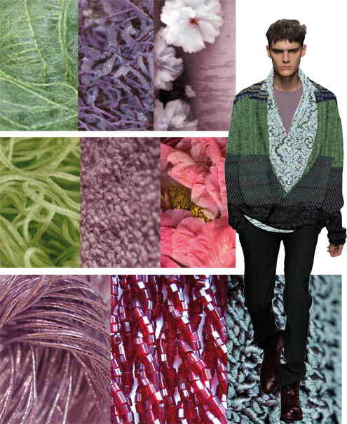
The palette called Connoisseur takes a fresh approach to celebrating the finer things in life while displaying a sense of history and elegance. Whether it is the perfect plate or the smooth finish of a simple table linen, these fine sensibilities are often reflected in a choice of colors that are both sophisticated and refined, yet not without a touch of understated drama. The colors are a compilation of monochromatic violets and orchids, liquid pink, deep mahogany, alyssum white and beechnut green, all reflected against champagne beige and silver.
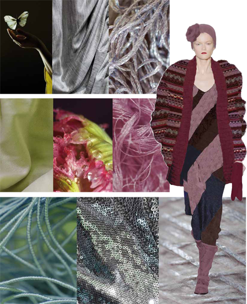
The very word Glamour expresses what this palette is all about. Sleek and sensuous, it is very much reminiscent of the Art Deco era interpreted with contemporary influences. There is something very personalized and unique in the beguiling styling that involves both confidence and flair. Colors adequately reflect the mood of a bygone era: Rio red, and Monaco blue, deepest tap shoe black and chinchilla, ethereal gray moonmist and jasper teal. To add more glimmer to the glamour, there is both silver and champagne beige.
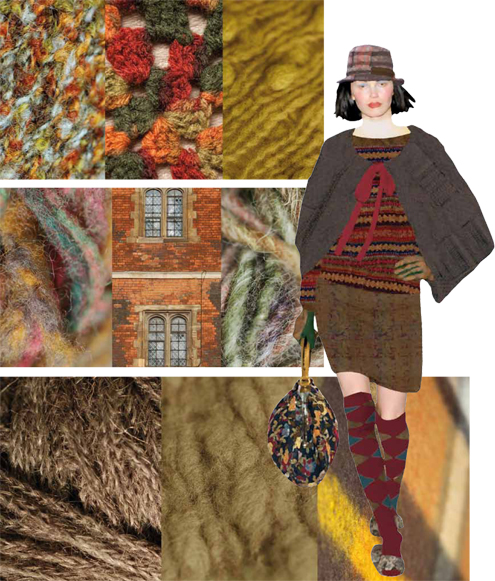
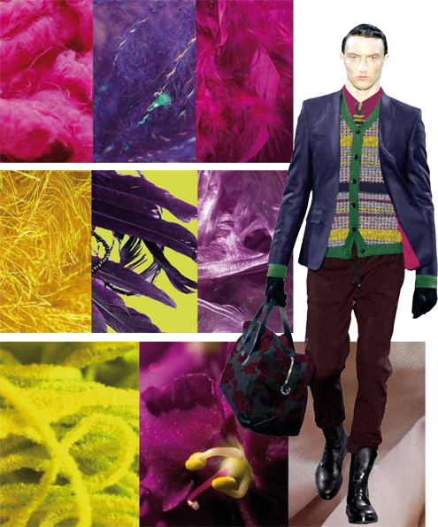
Another palette emphatically connected to heritage and history is New Old School. Adding a twist to a somewhat "preppy," collegiate and classic palette, it celebrates the hues typically found in iconic flags and banners. The styles are also reminders of the past, yet some sport a new contemporized look. There is ribbon red, bright white and sodalite blue, while nautical blue salutes breen and ultramarine green. Gargoyle and microchip grays draw a visible link to the contrast between the old world and the new.
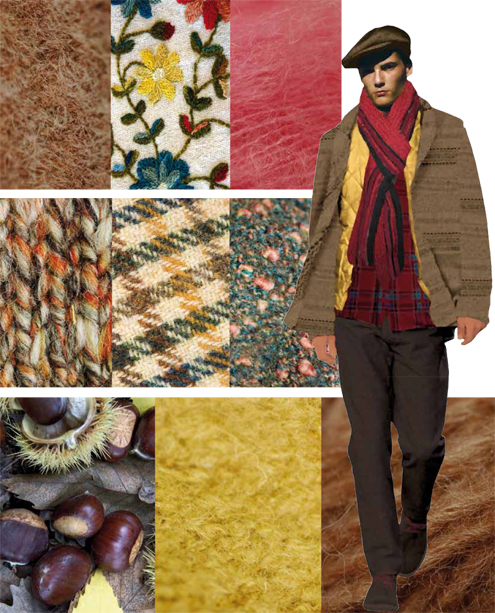
Ranging from out West to the Outback, picking up the "ole" of the gaucho along the way, cowboy and cowgirl styles ride firmly into interiors. These are the Rugged Individuals who encourage and inspire the natural shadings of the prairie, polished leather, weathered wood and animal hide, while the earthiness of raw sienna tones blend with the inevitable classics of both vintage indigo and stonewashed blue jeans.
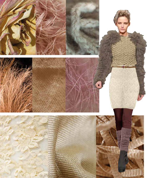
Taking orangey and spice tones to a new level, Extracts employs flavorful notes of color along with suggestions of appealing scents to create combinations that are zestful, pleasing, piquant and often unexpected. There is a subtle taste implied in this palette that evokes a somewhat exotic top note in spiced coral, brandied melon and apple cinnamon. The quiet presence of dusty pink and baked clay is refreshingly balanced by a tart, green banana.
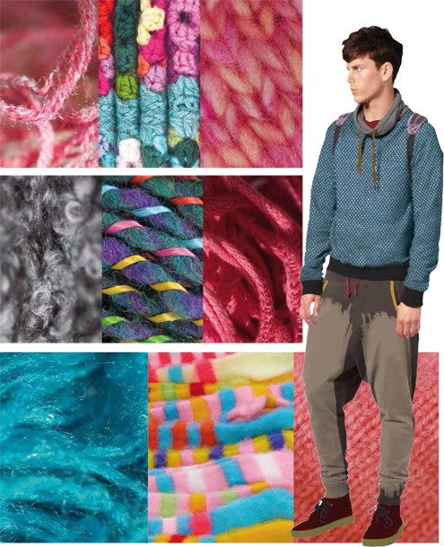
Footprints is a palette that leads us down a path to vibrant tribal colors. These are steps that are not taken lightly, but instead are bold, forthright and very directional. Following the seductive rhythm of tangerine tango are peacock blue, a fiery pink flambe and solar-powered yellow. A verdant yellow green called oasis provides respite from the heat of Sudan brown.
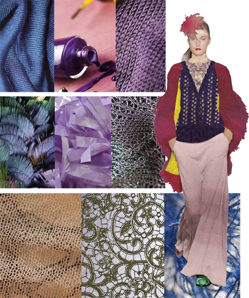
The Sojourn palette takes us on a journey, one that is a bit more magical and intricate, as reflected in the compelling mixtures of a heady Syrah wine hue, the purpled intensities of a blackish plum, and the rosy glow of foxglove and Baton Rouge fuchsia against pampas and the green winter moss. All are nestled comfortably within the grounded organic hues of cobblestone and shitake.
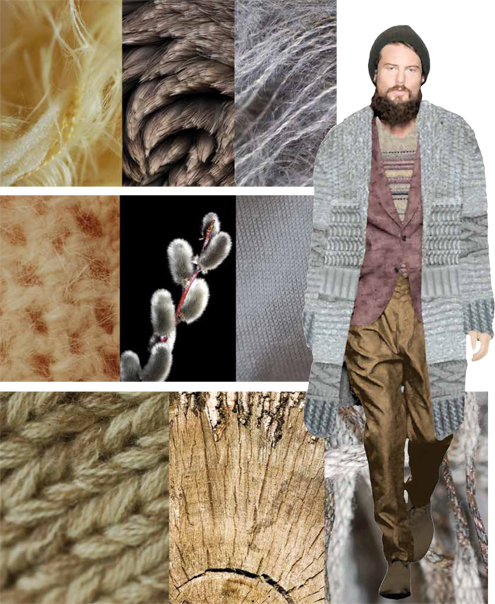
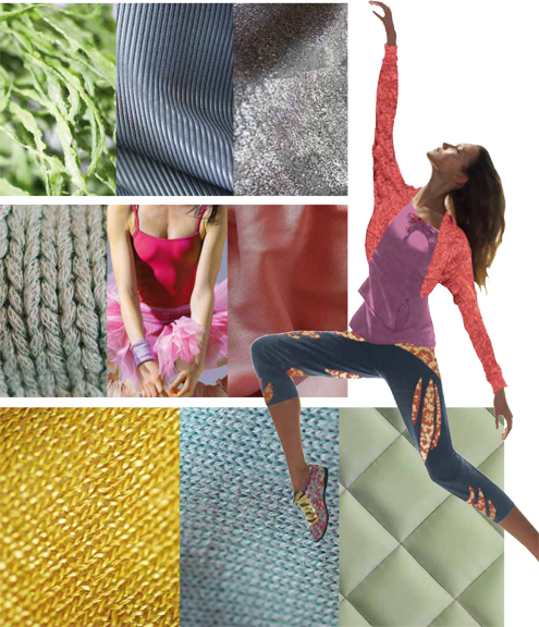
Surface Treatments is a highly textural palette that adeptly utilizes smooth and nubby - polar opposites in a tactile world. It likewise embraces the liquid colors of ocean, sea and air such as Maui blue, vapor blue, and a more tempestuous tornado gray, along with the land-locked colors of fallen rock and birch, combined with a vegetal agave green. Medal bronze adds yet another dimension and patina to this diverse yet compatible grouping.
Quirky, odd, whimsical and even a bit obtuse, Out of the Ordinary products immediately capture the imagination of the beholder. It can be styling, texture, shape or design that reaches out to tempt the eye, but most frequently it is the color that captures instant attention and awareness. Colors like bonnie blue, pureed pumpkin and chocolate truffle are deliberately enticing, while amber green, linden green, golden rod, bright violet and rosebud round out this creative array.
Read more: http://www.dexigner.com/news/24716#ixzz1ozZLG8PF"